For all enquiries: email [email protected]

Categories
Systems

Snapper Rock by Bindon Design Group

Case Study
|
November 15th, 2022

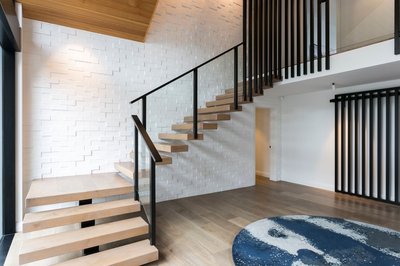
What began as a modest remodel of an existing post modern plastered masonry home developed into an extensive redesign of the home including a whole new second level and redesign of the downstairs spatial room arrangements. The gabled entry became the focal point to the architecture with a new feature cantilevered stair ascending to a new second level with three bedrooms each with their own bathroom with interiors to match the teenage occupants. An extended master suite was the serendipitous outcome of the project. Enlarged to accommodate a sitting area and positioned to encapsulate the views over the landscaped pool area below and valley views beyond. 

Featuring a super king bed and custom bedside units by Trinity Interior Design and a hydraulic mount for the TV that gravitates from the ceiling when required. To compliment the master, an opulent master bathroom was designed with spa bath and walk-in fully tiled shower, all lit with energy efficient LED lighting and automation. Back downstairs, and accessed of the light filled entry atrium, the main formal lounge was almost doubled in size by removing some of the post-modern angles to form usable symmetrical and rectangular spaces. 

Strong indoor/outdoor connections to the pool and patio were provided with large stacking Altus Eurosliders

and custom cabinetry, again for the entertainment centre and linear fireplace. The informal living room was spatially redesigned and rebuilt with a reconfigured modern glass breakfast conservatory, providing much needed natural light into the previously dimly lit space. A new covered outdoor alfresco space with Louvretec roof and linear gas fireplace was added as was the family desk space incorporated into the living room with inbuilt custom joinery. The Kitchen, originally proposed to be untouched was also upgraded including a large island as the hub of the entertainers space. A butlers pantry was then added with views up the driveway and easy access of the central core.
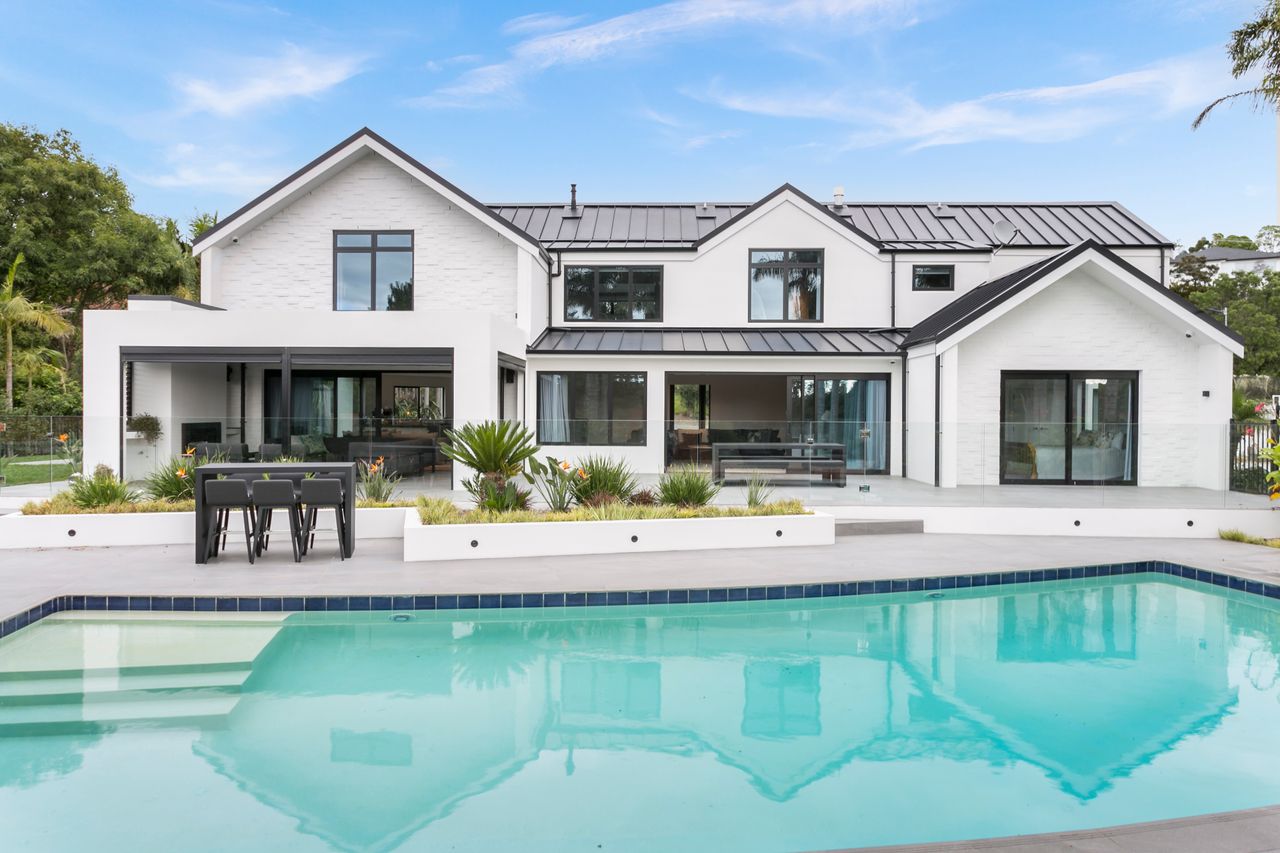
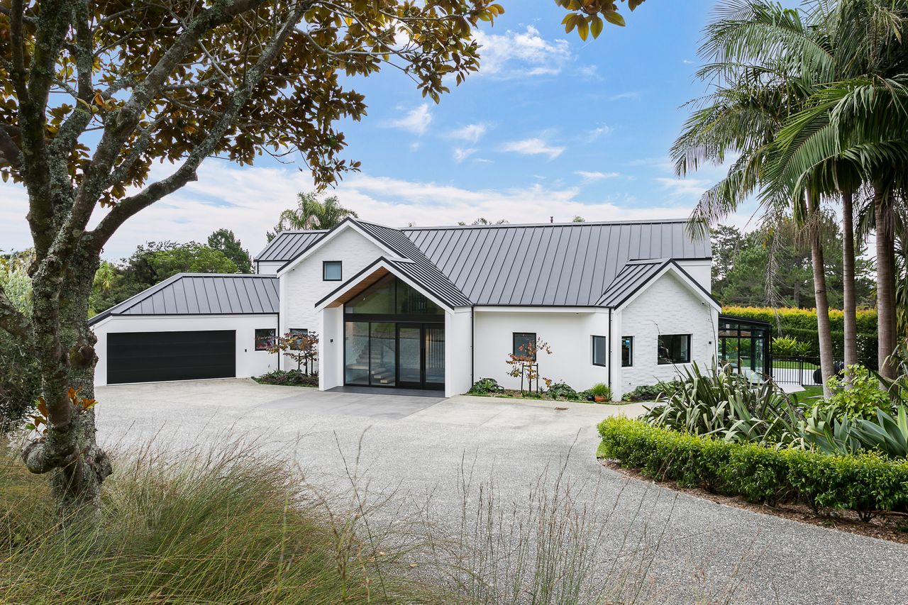
The exterior of the house was completely transformed with a monochromatic colour scheme incorporating solid plastered masonry in Resene Sea Fog and textured brick slips feature walls which blur the lines between inside and out with its continuation into the entry. The ironsand eurostyle standing seam roofing complimented the new clean and crisp lines and colour scheme. Add in the sustainable western red cedar shiplap tongue and groove sarking to the ceiling and you have a material palette that is very clean, contrasting and eye catching. Finally, the property was landscaped to compliment the home and provide that added touch to the indoor/outdoor feel of this now state of the art modern masonry family home.

This renovation/alteration to a lifestyle home uses texture and a monochromatic colour palette to really pop. The bold gable roof forms are striking as you descend the driveway to approach the home. The oversized front door expressed within a large glazed gable form affords a glimpse of the entrance atrium and the apparent skeletal form of the building within.

Photographer: Tamati Te Oka

Architects: Bindon Design Group

Get In Touch

Enquire now